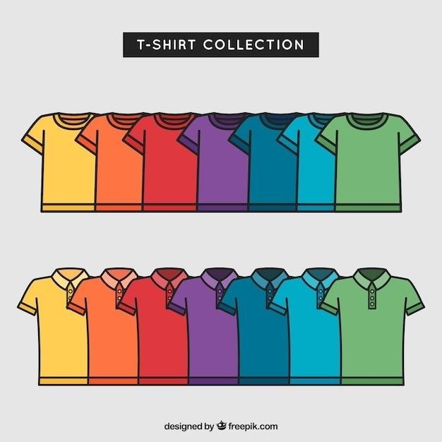
This guide provides comprehensive information on strategic logo placement for polo shirts, covering various factors to consider, common placements, and essential tips for achieving a professional and impactful brand presence.
Choosing the Right Placement
Selecting the optimal logo placement on a polo shirt is crucial for maximizing brand visibility and creating a cohesive aesthetic. The placement should align with your brand’s identity, the intended use of the shirt, and the overall design of the garment. Consider factors such as the size and complexity of the logo, the target audience, and the desired level of prominence.
A well-placed logo can enhance the shirt’s appeal and communicate your brand message effectively. For instance, a large logo on the back might be suitable for promotional apparel or team uniforms, while a smaller logo on the chest might be more appropriate for corporate wear or everyday attire.
Ultimately, the best logo placement is one that strikes a balance between visibility, aesthetics, and brand consistency. Carefully evaluate your options and choose a placement that resonates with your brand and target audience.
Chest Placement
Chest placement is a classic and widely favored option for polo shirt logos, offering a prominent and balanced position. This location allows for good visibility while remaining subtle enough for professional settings. There are two primary chest placement variations⁚ left chest and center chest.
Left chest placement is particularly common for corporate wear and employee uniforms. The logo is typically positioned 3.5 to 4 inches from the center edge and 6 to 8 inches from the left shoulder seam, ensuring a consistent and easily recognizable placement. Center chest placement, on the other hand, is often used for larger logos or designs that need to be more prominent. The logo is centered on the chest, usually 4 to 6 inches down from the neck seam.
When deciding between left chest and center chest placement, consider the size of your logo and the intended purpose of the shirt. A smaller logo might look best on the left chest, while a larger design might be more impactful in the center.
Sleeve Placement
Sleeve placement offers a unique and often understated approach to logo placement on polo shirts. This placement can be particularly effective for brands that want to add a subtle touch of branding without overwhelming the design. Logos on the sleeve can be placed on either the left or right sleeve, depending on the desired aesthetic.
A common sleeve placement guideline is to position the logo 7.5 to 9 inches from the left shoulder seam and 4 to 6 inches from the center of the sleeve, in line with the collar meeting the shoulder seam. This placement ensures that the logo is visible but not overly prominent.
Sleeve placement is particularly well-suited for smaller logos or designs. It can also be a good option for brands that want to create a more casual and relaxed look. However, keep in mind that sleeve placement may not be suitable for all logo designs. Consider the shape and size of your logo, as well as the intended use of the shirt, before opting for sleeve placement.
Back Placement
Back placement is a bold and attention-grabbing option for polo shirt logos, often used to make a statement or showcase a larger design. This placement offers ample space for larger logos or intricate designs, allowing for greater visibility and impact.
When considering back placement, it’s essential to choose a position that aligns with the overall aesthetic of the shirt. The most common placement is centered on the back, either at the upper back or lower back, depending on the desired look. For a more casual feel, the logo can be placed slightly off-center, closer to one shoulder;
Back placement is particularly effective for creating a sense of brand presence and authority. It can be used to showcase a company’s name, slogan, or a larger, more detailed design. However, it’s important to note that back placement can be overwhelming if not done correctly. Consider the size and complexity of your logo, as well as the overall design of the shirt, before opting for back placement.
Pocket Placement
Pocket placement offers a subtle yet effective way to incorporate a logo on a polo shirt. It’s a popular choice for smaller logos or designs that complement the shirt’s overall aesthetic without overpowering the overall look. This placement is particularly well-suited for minimalist logos or designs that are meant to be understated and elegant.
When considering pocket placement, it’s important to choose a position that aligns with the pocket’s design and size. The logo can be placed directly on the pocket, either centered or slightly offset. It can also be placed above or below the pocket, depending on the desired visual impact. For a more contemporary look, the logo can be placed on the pocket flap, adding a touch of sophistication.
Pocket placement is often used for logos that are meant to be subtle or discreet. It’s a good option for brands that want to maintain a sense of professionalism or understated elegance. However, pocket placement may not be suitable for larger or more complex logos, as it can create a cluttered or overwhelming appearance. Consider the overall design of the shirt and the size and complexity of your logo before opting for pocket placement.
Logo Size and Design
The size and design of your logo play a crucial role in its effectiveness and overall appeal on a polo shirt. A well-chosen logo size and design can enhance brand recognition, create a professional look, and leave a lasting impression. However, a poorly chosen size or design can detract from the shirt’s aesthetic and make the logo appear cluttered or overwhelming.
When determining the optimal size, consider the logo’s complexity and the shirt’s overall design. A simple logo can be slightly larger without appearing bulky, while a complex logo may need to be scaled down to maintain a balanced look. Remember, the goal is to create a visually appealing and easily recognizable logo that complements the shirt’s design.
The design of your logo is equally important. Ensure that it’s legible, easily recognizable, and reflects your brand’s identity. A well-designed logo will enhance your brand’s image and create a positive association with your company or organization. Consider the color palette, font choices, and overall aesthetic to ensure that your logo harmonizes with the polo shirt’s design and conveys the desired message.
Brand Consistency
Maintaining brand consistency is essential for creating a cohesive and recognizable brand identity. This principle applies to all aspects of your brand, including logo placement on polo shirts. Consistency in logo placement ensures that your brand remains identifiable across all platforms and helps to build a strong and recognizable brand image.
When placing logos on polo shirts, strive for consistency in size, position, and design. This means using the same logo size and placement on all shirts, regardless of the shirt’s color or style. Consistency also extends to the logo’s design itself, ensuring that the logo’s colors, fonts, and overall aesthetic remain consistent across all applications.
By maintaining brand consistency in logo placement, you create a unified brand image that resonates with your target audience. This consistency helps to build brand recognition and strengthen customer loyalty. A consistent brand identity fosters trust and credibility, making your brand more memorable and appealing to potential customers.
Factors to Consider
When deciding on the optimal logo placement for your polo shirts, several factors deserve careful consideration. These factors influence the effectiveness of your logo placement and ensure it aligns with your brand’s message and target audience.
The first factor to consider is the nature of your work or the intended use of the polo shirt. If the shirts are for employees, a professional and subtle logo placement might be preferred. However, if the shirts are for a sporting event or a promotional campaign, a more prominent and eye-catching logo placement might be more suitable.

The size and design of your logo also play a crucial role in logo placement. A smaller logo might be best suited for a subtle placement, while a larger logo might demand a more prominent position. The overall design of the logo, including its colors and fonts, should also be considered to ensure it complements the polo shirt’s style and color scheme.
Finally, think about your target audience and their preferences. Consider their age, gender, and interests when choosing a logo placement that resonates with them and effectively communicates your brand’s message.
Measuring and Aligning
Precise measuring and alignment are crucial for achieving a professional and polished look with your polo shirt logo placement. While some may prefer a more casual and free-flowing approach, a consistent and well-executed logo placement enhances brand recognition and professionalism.
Start by selecting a reliable measuring tool, such as a tape measure or ruler, and ensure you have a clear understanding of the desired logo placement. Use a pencil or marker to lightly mark the designated spot on the polo shirt, ensuring it aligns with the shirt’s seams and overall design.
When measuring for logo placement, consider factors like the size of the logo, the shirt’s size, and the desired visual impact. For instance, a smaller logo might require a more precise placement closer to the collar or sleeve, while a larger logo might benefit from a more central position on the chest or back.
Pay close attention to symmetry and alignment. Ensure the logo is centered and balanced, creating a visually appealing and professional look. Consider using a level or a guide for extra precision, especially when placing logos on the chest or back.

Additional Tips
Beyond the core principles of logo placement, consider these additional tips to elevate your polo shirt design and maximize brand impact⁚
- Consider the fabric and its texture⁚ The type of fabric can influence the look and feel of the logo. For example, a logo on a textured fabric might appear less crisp than on a smooth fabric. Experiment with different fabric types and logo placement to find the most visually appealing combination.
- Explore color combinations⁚ Choose colors that complement the shirt and logo, enhancing the overall design. Contrasting colors can create a bold statement, while matching colors can offer a more subtle and refined look.
- Think about the target audience⁚ Consider the intended wearers of the polo shirts when deciding on logo placement. For example, a business-oriented design might favor a more professional chest placement, while a casual design might explore a more relaxed sleeve or back placement.
- Experiment with different logo styles⁚ Don’t be afraid to experiment with different logo styles, sizes, and orientations to find the best fit for your polo shirt design. Consider using mockups or digital tools to visualize the final look before committing to a specific placement.
- Seek professional advice⁚ If unsure about logo placement or have a complex design, consider seeking professional advice from a graphic designer or apparel specialist. They can offer valuable insights and guidance based on their expertise.
By incorporating these additional tips into your logo placement strategy, you can create polo shirts that not only showcase your brand identity but also leave a lasting impression.


